
Hot Day
A downloadable game
Download NowName your own price
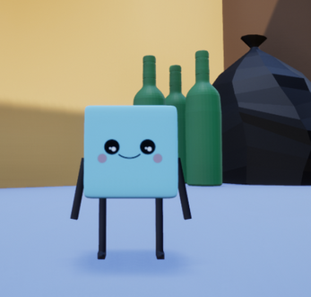
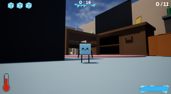
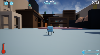
You play as an ice cube trying to avoid the sun! Make sure to go through tutorial! Have fun guys :)
Game made in 72h for Ludum Dare 46 Game Jam with theme: Keep It Alive.
Devlog:
Controls:
WASD - movement
Space - jump
Left / Right mouse button - time manipulation
ESC - Pause
UPDATE
- Fixed game breaking bug
- Fixed save game bug
I hope this update is ok with LD46 rules :)
KNOWN BUGS :/
- Pixelated buttons first few seconds
| Status | Released |
| Rating | Rated 4.0 out of 5 stars (3 total ratings) |
| Author | sypdev |
| Genre | Platformer, Puzzle |
| Tags | 3D, 3D Platformer, Game Jam, Ludum Dare, Ludum Dare 46, Singleplayer |
| Links | Ludum Dare |
Download
Download NowName your own price
Click download now to get access to the following files:
HotDay.rar 104 MB
Comments
Log in with itch.io to leave a comment.
Alright here goes for my first comment on Itch.io.
I am not if are required to release the source code for your games anymore for the Ludum Dare, hence I am not sure if you still qualify for the competition. Unless you are participating in a Jam that is different. Just giving you a heads up
Now regarding the game concept, its original, its creative, it used the minimalist art style very nicely. I can't argue against the idea nor how you demonstrated it out. Excellent work.
Now regarding the Tutorial level, that is where it might be a good idea to look into having pop ups, like the ones that would appear in the old console ear, specifically ps1, original xbox. The design choice of a ball as a coin confused me at first until I heard the sound effect then I knew I picked up a coin. The controls were laid out at the start of the tutorial level, but it might be a good idea to either have a button to press on to quickly see all the controls or make the pause menu have that option or make an option in the main menu that shows the controls.
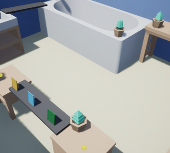
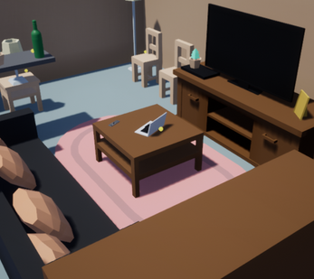
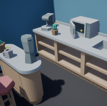
Now regarding the level selection that was very creative. I liked how you can walk to the levels and enter each door, but learning about popups would have been a nice so that when you reach each door, but if you decide not to that aspect is good enough that if you left it the way it was then it would be good. Now it would be cool if you named each door as well. Such as the SkyScraper Kitchen or The Kitchen as you had to go to the top of the counter. Something along those lines but don't name them something too bizarre.
Now regarding the levels they are nicely laid out, but the movement is not that smooth. You either jump too far or not far enough. If you can work on that it would be great. Another part is the fact that we don't have map that lays out where the coins are, so it becomes hard to find the coins. Another thing is that melting aspect. The ice cube melts very quickly when under the sun, which would be nice if it didn't melt as fast, as in real life the ice cube doesn't melt as fast.
Animations wise, the ice cube animations for the face are pretty good, if you wanted some tips i would recommend figuring out how to animate the arms and legs to change based on what is going on. Example when you jump to first bend the legs and arms and when you jump off you extend both.
Also the metric for the timer was not really explained we (At least from 10 minutes of playing before the laptop fans started to spin really loud), but I figured that it might be linked with how fast you complete the level.
Also if you can make the tutorial level much longer it would be greatly appreciated.
Future things to consider would be making the menu buttons/images along the same color scheme as the game. Like right now i get you have both 2d assets and 3d assets, but if you want to see a game where the mixture was effectively done well, celeste is a good example. The level selection had 3d elements to it, but it was not as noticeable nor as obvious to many people. However, you can also easily solve this by having the UI elements have a similar shade of color as the 3d assets
I think that is all I can think of at the moment. Overall, nice work for 72 hours worth of effort!
Hi idah6, thanks a lot for the write up, Im glad that you decided to loose your comment virginity on my game :D
Source code is only required for combo LD and I participated in the jam. I was restricted by the time but I also think the popups would work better than text in the level, but it was the quicker way. The same is with the coin model, my friend who was doing some of the assets gave up after first day so I went with the quickest way to do collectable - the sphere.
The level names are brilliant idea and I will surely add it in the next update. Basically I agree with all your points except of one - the map. I quite like the exploration factor of the game, but I agree it can get frustrating. Maybe adding sound when you are near a coin is way to go. (similar to Fortnite chests).
Thanks again for the feedback, I will update the game as soon as I can. If you want to participate in testing (If I decide to continue developing the game to commercial release) you can join my discord (https://discord.gg/QShCdg) so we can talk more frequently. Also If you are interested, I made a video about development of this game and on what went wrong :D
https://www.youtube.com/watch?v=-e3t9jD94VU